Why Your Website Needs to Utilize Conversion Rate Optimization Development and Design

Conversion Rate Optimization (CRO) has become a hot topic in the marketing industry today. It is an important element in any Growth Driven Design (GDD) strategy. Website design for outdoor brands should seek to capture and convert visitors. It is the basis for the digital success of your business as a whole. With one report finding that 78% of websites are not conversion friendly, do you know where your outdoor brand website stands on conversion friendliness?
It’s no secret that your website is the face of your business. If you are planning on growing your outdoor industry brand, then you need a website design that is GDD based and incorporates well thought out and designed interactions with visitors that optimize creating conversions.
 In an ever increasing digitally connected world, it is imperative that your website not only showcases your business effectively, but is a working tool that facilitates your business activities every day. The difference between good and bad web design can seriously affect viewer's opinion of your business. Whether it be supplying your viewership with product information, or industry data, or information about your service offerings and abilities. Every website supplies the majority of initial contacts between a user and your business. That’s where CRO comes in. But before we apply it to website design, it’s important to understand what exactly CRO is.
According to Wikipedia: “In internet marketing, conversion optimization, or conversion rate optimization (CRO) is a system for increasing the percentage of visitors to a website that convert into customers, or more generally, take any desired action on a webpage.”
So basically CRO is identifying what you want your website visitor to do, monitoring your site to see if users are doing it , determining if they are doing it well or not so well, then implement changes to help them do it better.
So why is this important?
Let’s consider some facts about CRO.
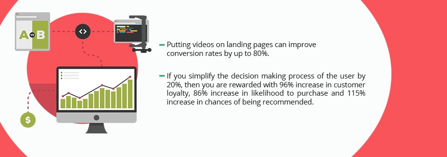
- Putting videos on landing pages can improve conversion rates by up to 80%.
- Research insights from CEB suggest that if you simplify the decision-making process of the user by 20%, then you are rewarded with 96% increase in customer loyalty, 86% increase in likelihood to purchase and 115% increase in chances of being recommended.
- A study by Hubspot says that Businesses with more than 40 landing pages generate at least 12 times more leads than those with 1-5 landing pages. 12 times leads? How much increase in ROI? Think about that.
- Conversion rates increase when your goals and user goals meet.
- More than 90% of the visitors who read your ad/website headline, they also read your CTA copy.
- Using correct targeting and testing methods can increase conversion rates up to 300 percent.
Long gone are the days of your website being simply a brochure that tells the world how great your company is. If you aim to compete in today’s marketplace you need a website that converts. So what is a conversion based website? It is a website that is a lead generation machine. Not only does your website guide users to the content they are looking for, it positions that content in a way that gathers valuable user information for you to then use in your marketing efforts to eventually turn that visitor into a customer.

This is essentially a sales rep that never sleeps, never eats, and has 100% productivity, 24hrs a day, 365 days a year. How powerful of an impact could having a sales rep like that be for your business? For agencies, HubSpot wrote a great article detailing 5 strategies for building a conversion based website. In it they mention the following:
- Establish clear positioning reinforced by intelligent design
- Create and share content to start a relationship
- Capture a visitor’s interest and always remember their name.
- Keep the romance going
- Set goals, track metrics, analyze and tweak
What is the difference between a standard website and a conversion website?
The answer to this may not be as straight forward as one might hope. There isn’t really a defined set of criteria that determines if your site is a conversion based website or not. In fact, even if it’s not, your site may still have conversion based elements on it. For instance, 99.9% of websites have a contact page. The overwhelming majority of those will have a contact form on it. The contact form can definitely be considered a conversion element. So what does it take to go from one to the other?
In general, it comes down to strategy. A conversion based website takes the user into consideration in the design and implements strategy to engage the user and guide them further down the buyer’s journey.
It is possible to implement conversion paths into existing sites, but if at all possible, it’s best to take a conversion based approach from the very beginning. A site is designed with the end user in mind and centered on the desired actions you want them to take. Do you want your user to request a demo? Then the design of the site should be geared toward guiding the user to that request. Everything down to the angle of the background image that guides the user’s eye toward the next section on the page should be focused on the desired actions. For more information Oli Gardner wrote a great post for evantotuts+ for designers looking to be more conversion focused. It was written a couple years ago but still just as relevant today as it was then. If you aim to remain competitive in this industry, you’re going to need to keep up.
How to tell if your site is built for conversion?
Everyone loves checklists. So here’s a quick and dirty checklist to help you audit your own site?
- Does your site have conversion points? (POINTS – plural, meaning your contact page doesn’t count) That is, are there buttons / links / images / pop ups / or anything else that a user can click on, that leads them to some place they can give you their information?
- Does your site capture lead data? Do you utilize forms on your site? Per number 1, there should be numerous forms on your site. Landing pages, informational pages, sidebars, and footers are all good places to incorporate forms. The key is to make the progression to the form logical and casual so as not to make your visitor feel pressured to fill it out.
- Does the site have user paths? Are there defined avenues you want the user to take? For example, user arrives on the homepage, they decide what of 3 services they're interested in. Clicking one leads to a page with more information about that service. At the bottom of the page there is a CTA about a case study showcasing how spectacular their service is. Clicking on that takes the user to a landing page where they can request a quote for that particular service they’re interested in? That’s an intended user path we want the visitor to take in order to convert as a lead.
- Is your site constantly updated? Are you gathering UI/UX analytics and evaluating to see where opportunities lie? If you are not constantly evaluating your websites performance, then your site is acting more as a brochure rather than a tool. Take a Growth Driven Design approach and keep an eye on your user behavior and test hypotheses around what you think can increase engagement.
- Is your website built in a CMS that allows for tracking, automation and workflows? Although this isn’t specifically related to the design, building your site using functionality that allows for automated follow up emails when a user fills out a form. Or structuring a contact list of people who all converted on the same offer to notify them of a related offer they might be interested in. Using the technology at your disposal allows you to take the info your website collects and use that to make your marketing efforts more targeted and efficient.
- Does the design take your audience into account? Is your site based on your own personal tastes? Often it is because as business owners, we take an autobiographical approach to our sites. We want to showcase the best us. But your audience isn’t you and what you like might not tickle their fancy as much as it does you. Spending time analyzing your audience to see what type of imagery resonates with them, what sort of voice and messaging to they relate to more, and where are they consuming their information? Is it social media, phone or tablet, reliable or unreliable internet access? All of these can have an effect on how you should design your site.
If you base your website on growth driven design for outdoor companies that includes great CRO features and tools, then everything else will flow to your desired end.

As you can see the days of static brochure sites are long gone. Technology has allowed website to be more powerful marketing and sales tools than ever before. You’re missing out if you’re not investing the time and energy needed to keep your website competitive. In times where financial hardships lead to the reduction of marketing budgets, you can make better use of your investments by focusing on that one sales rep that never sleeps and can generate leads for you 24/7/365.


