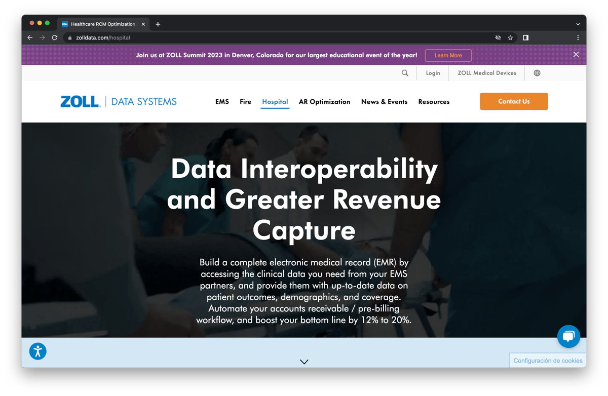
Medical Software & Technology Company Reinvents Website UX with a HubSpot CMS Redesign
OVERVIEW Healthcare Software & Technology Company Reinvents Website UX with a HubSpot CMS Redesign
Zoll Data is a company that provides software and technology solutions for healthcare organizations. With a global presence and customers in over 140 countries, the company's website serves as a crucial platform for lead generation and customer engagement. However, their previous website design was struggling to convert visitors into leads.
The website had poor user experience and navigation, making it hard for users to find the content they were looking for, resulting in low conversion rates. To address this issue, Zoll Data decided to partner with Instrumental Group to reinvent their website user experience with a focus on improving overall performance and greater lead generation.
CHALLENGE A website to match their in-person user experience
Zoll Data's previous website design had several issues. The navigation was confusing, and users had difficulty finding the information they needed. Plus, the company had expanded into additional service offerings that weren’t easily accessible or as prevalent on the website as they needed to be.
%2013.32.25.png?width=1200&length=1200&name=Captura%20de%20Pantalla%202023-04-21%20a%20la(s)%2013.32.25.png)
Old Navigation
%2013.33.49.png?width=1200&length=1200&name=Captura%20de%20Pantalla%202023-04-21%20a%20la(s)%2013.33.49.png)

"We knew we needed to provide many options with a limited amount of space. By organizing the navigation menu into horizontal columns, we were able to provide easy access to sub categories under each of their main verticals. "
Mike Del Cuore
The website lacked clear calls-to-action and conversion paths, which made it challenging for users to engage with the company. These issues resulted in low conversion rates and missed opportunities for demo requests.
GOALS FOR THE PROJECT The primary objectives for the website
By leaning on their existing sitemap, while planning for scalability to include their new verticals, we were able to highlight deeper service offerings and support their new target audiences:
- Easily connect various audiences with the content that mattered most to them.
- Showcase their software UI and highlight the benefits over features.
- Implement strategic conversion paths that lead to increase lead acquisition and provide for contact segmentation by audience.
- Maintain (and improve) SEO rankings to maximize post-launch ranking potential.
APPROACH Understanding the user to more deeply connect with them
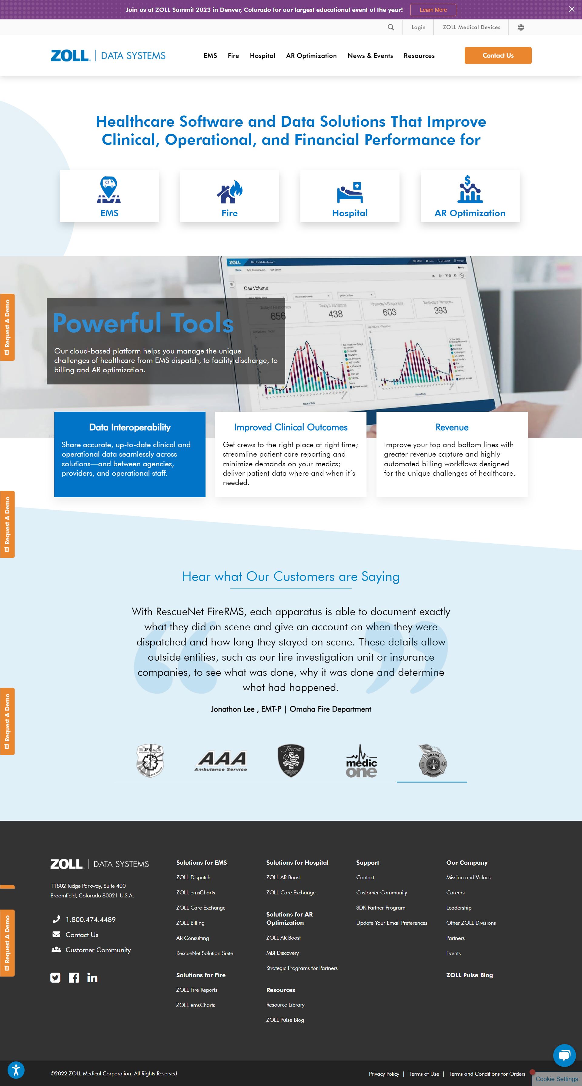
To address these issues, we took a comprehensive approach to redesigning their website user experience. We started by conducting a deep audit of their business, technology, target demographics, brand, and messaging. This research helped us identify pain points in the current website as well as some potential efficiencies we could implement with their lead capture. From there, we developed an entirely new site strategy that included the additional products and services they had to offer. Additionally, we were able to include additional verticals they were targeted with Hospitals and AR Optimization.
Our strategy and design framework fed development and designed to be built for scalability. This made it easy to add additional products and services as they became available on the fly.
Old Website Homepage

New Website Homepage

The new website was built for maximum usability in the HubSpot CMS so that the team over at Zoll Data could easily manage the site on an ongoing basis. This required best practice development and module accessibility to make sure we had all the functional requirements that were needed by the team. Although the majority of traffic came from desktop devices, it was imperative to ensure it was optimized for mobile devices as well. There was still a significant amount of mobile traffic so we made sure the design included an app-like experience with easy tap areas and clear conversion paths.
IMPACT Driving an amazing user experience
After implementing the new website design, Zoll Data saw a significant improvement in website performance and lead generation! They saw an increase in website traffic, user engagement, and conversions.
With an average 2,600 visits per month in May of 2020, the new site increased by 40% one year later and hit a high of 7,700 May of 2022. The new design also resulted in a 64% conversion rate increase in the first 5 months after launch, demonstrating the effectiveness of the user-centric design approach.
The end approach was a streamlined website focused on dedicated conversions that freed up the user to easily engage the content that they cared about most.
- Collaboration is key. Being able to harvest the intellectual property from the Zoll team, we were able to impart our expertise in user experience design to craft a cohesive message on the new site. Everyone was open and honest with feedback in effort to succeed as one.
- A user focused strategy works. By centering the client personas at the heart of our strategy, we were able to wrap the brand, people, technology, and processes of the Zoll team around a cohesive message that engaged various audiences with the information that was most important to them… easily!

Zoll Data's website redesign is an excellent example of how a user-centric design approach can help improve website performance and lead generation. By focusing on user needs and behavior and implementing responsive design and clear calls-to-action, Zoll Data was able to significantly improve conversion rates and engage more effectively with its various persona audiences. As a result, they achieved ROI on their investment and empowered their team to be more efficient and scalable moving forward.